X
share
view
next

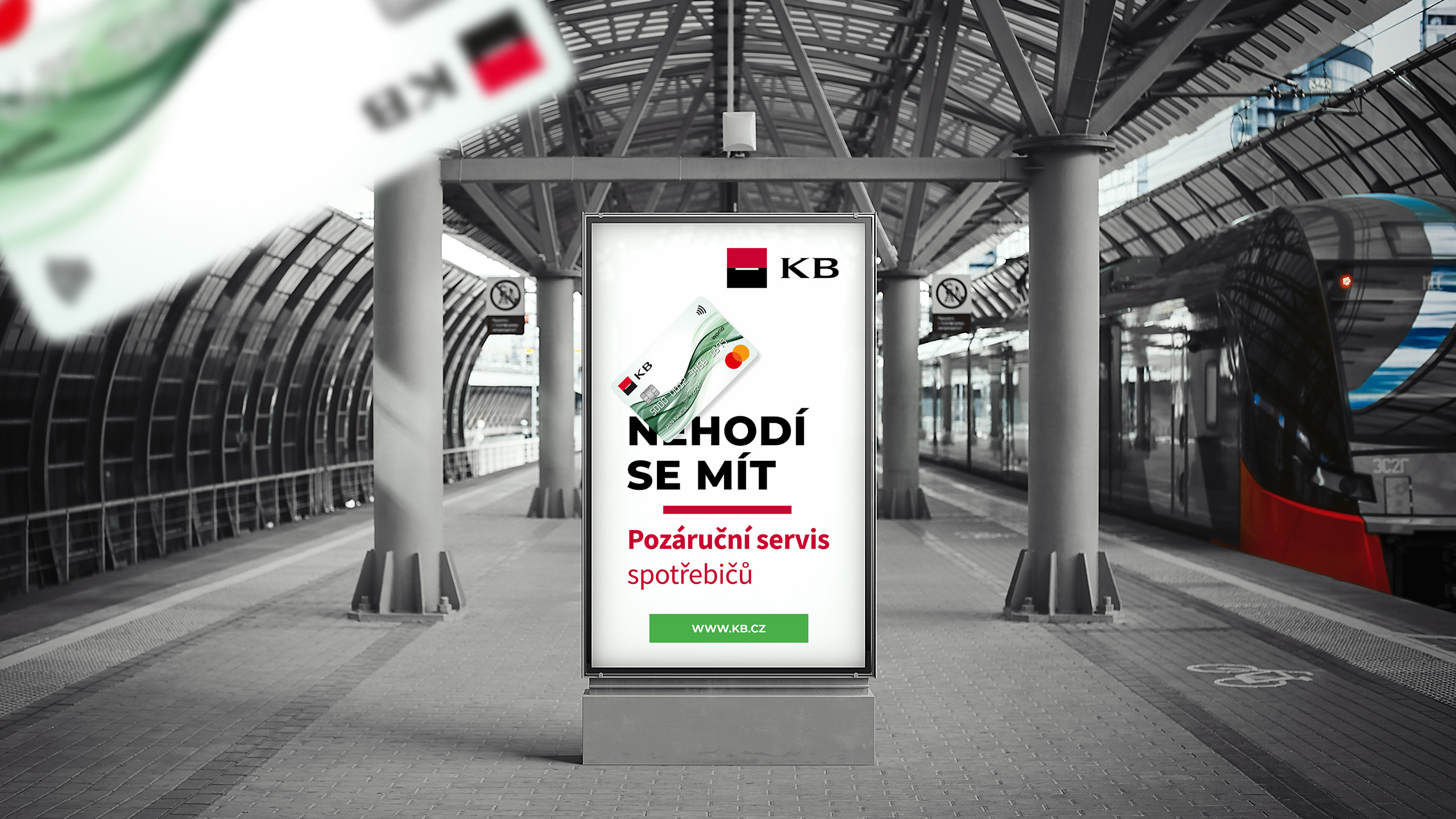

A continuation of the "Nice to have" campaign that we created for KB. This marketing was aimed directly at the people using the Prague public transport (for the most part).

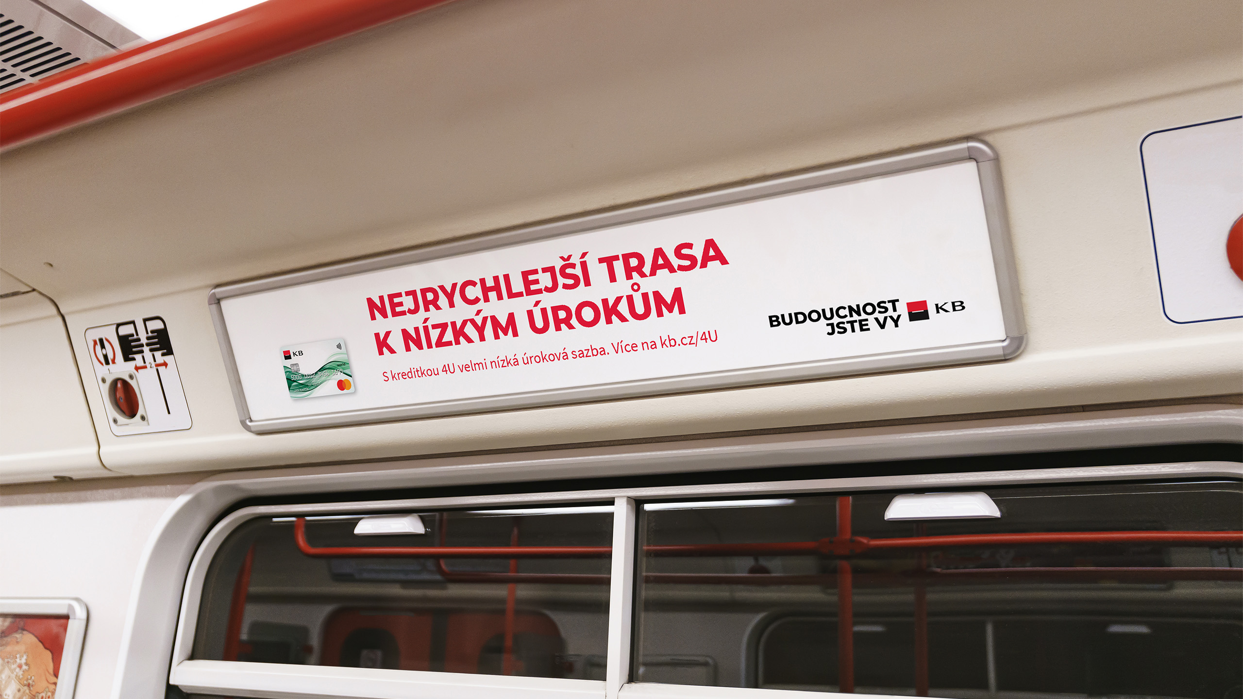
The main communication medium were the different format ads in the city subway system.
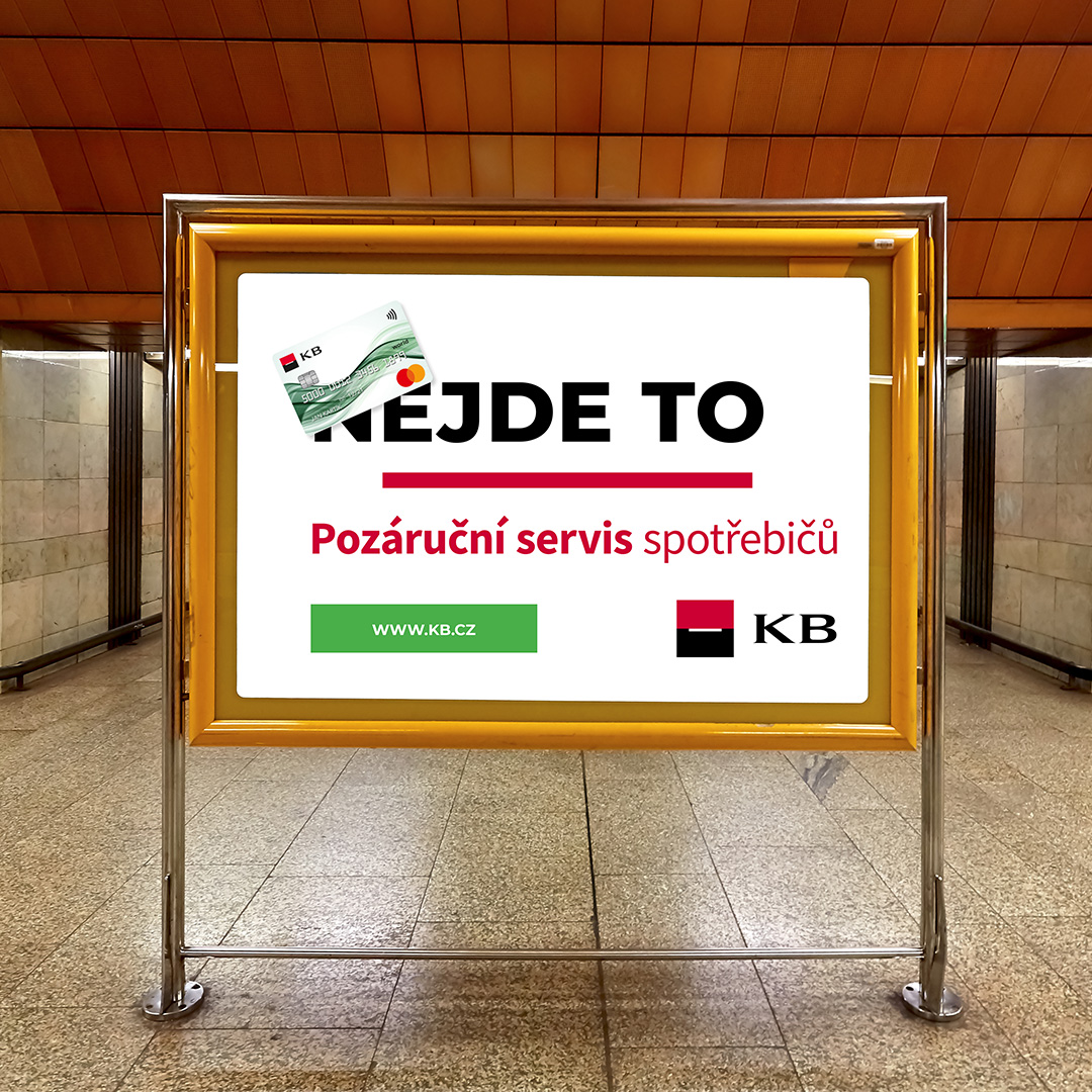
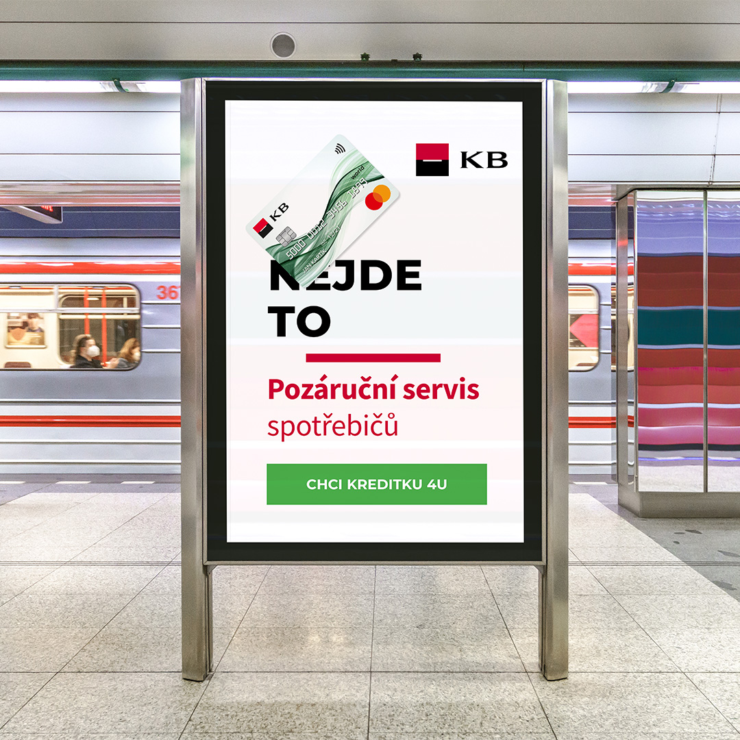
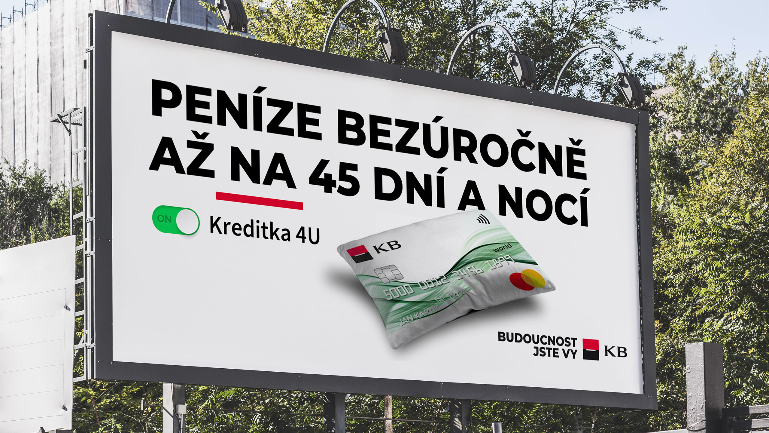
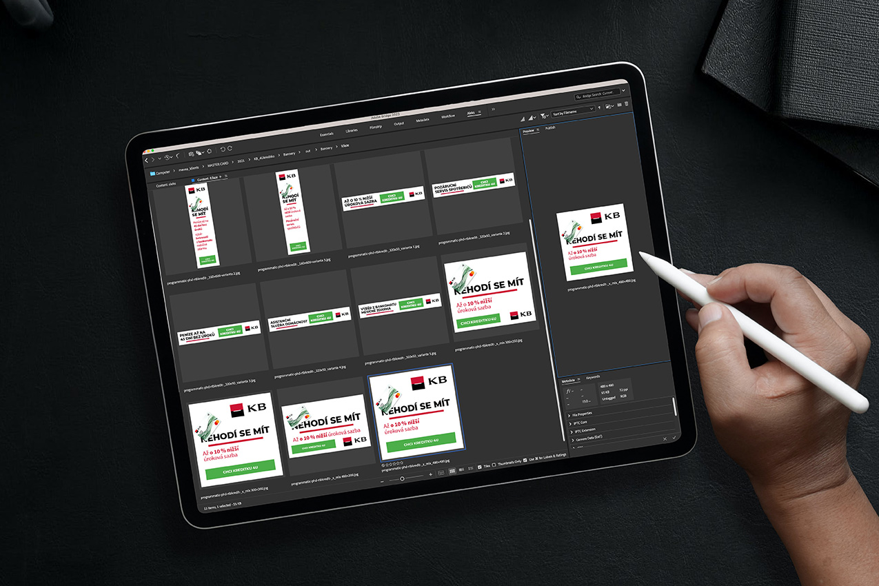
Aside from the "physical" formats we also prepared an extended array of web banners & social media ads.
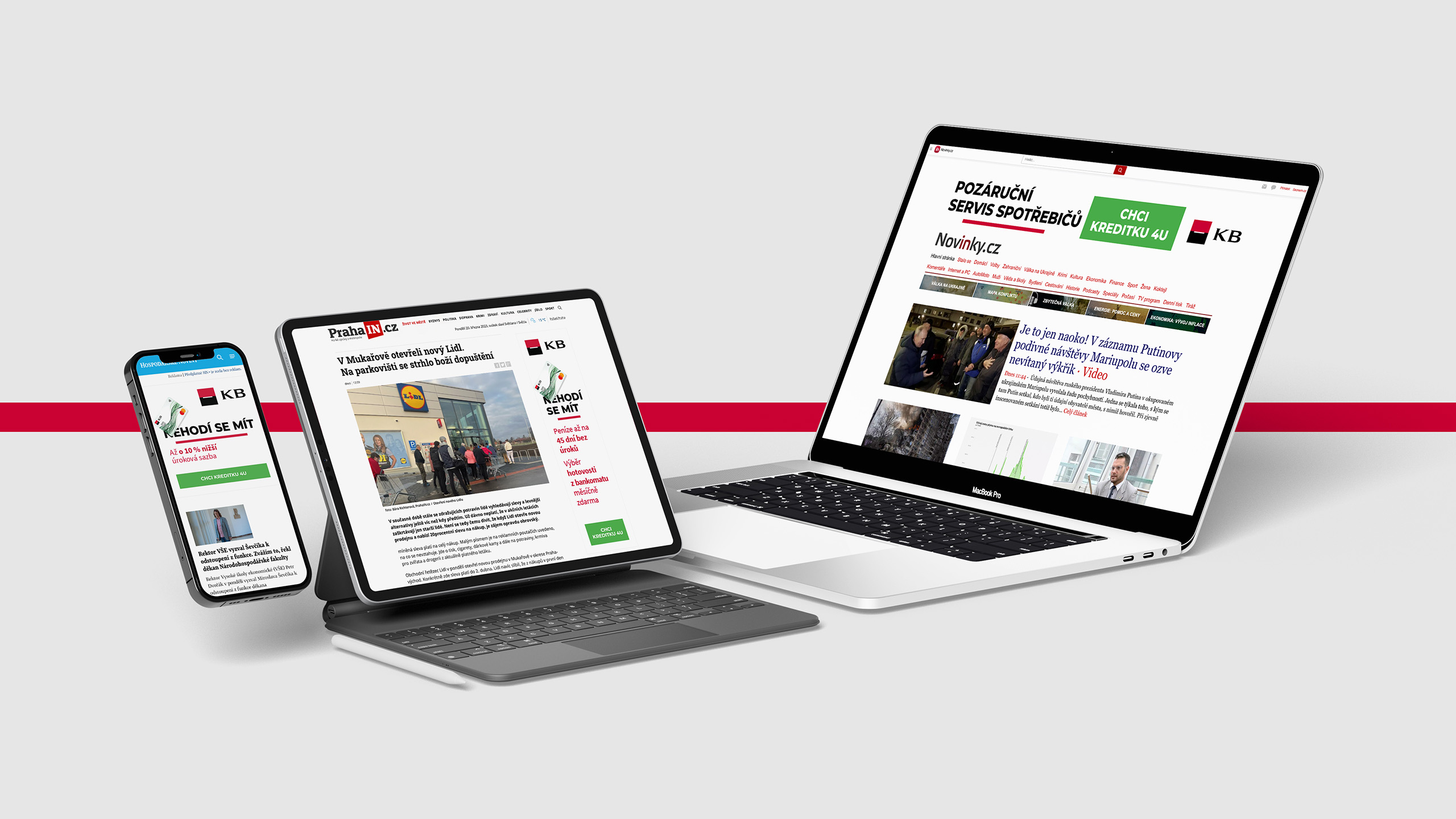
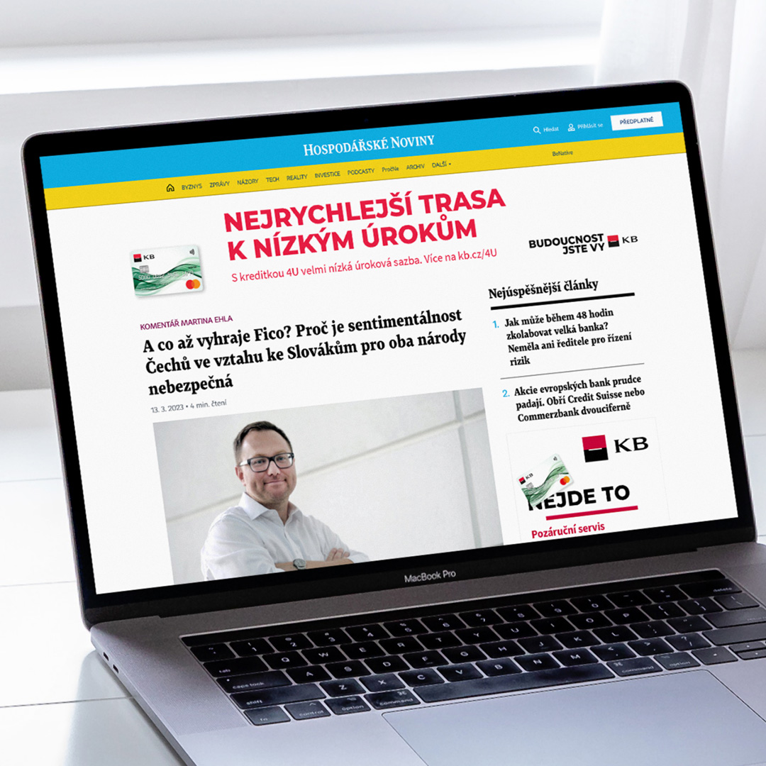
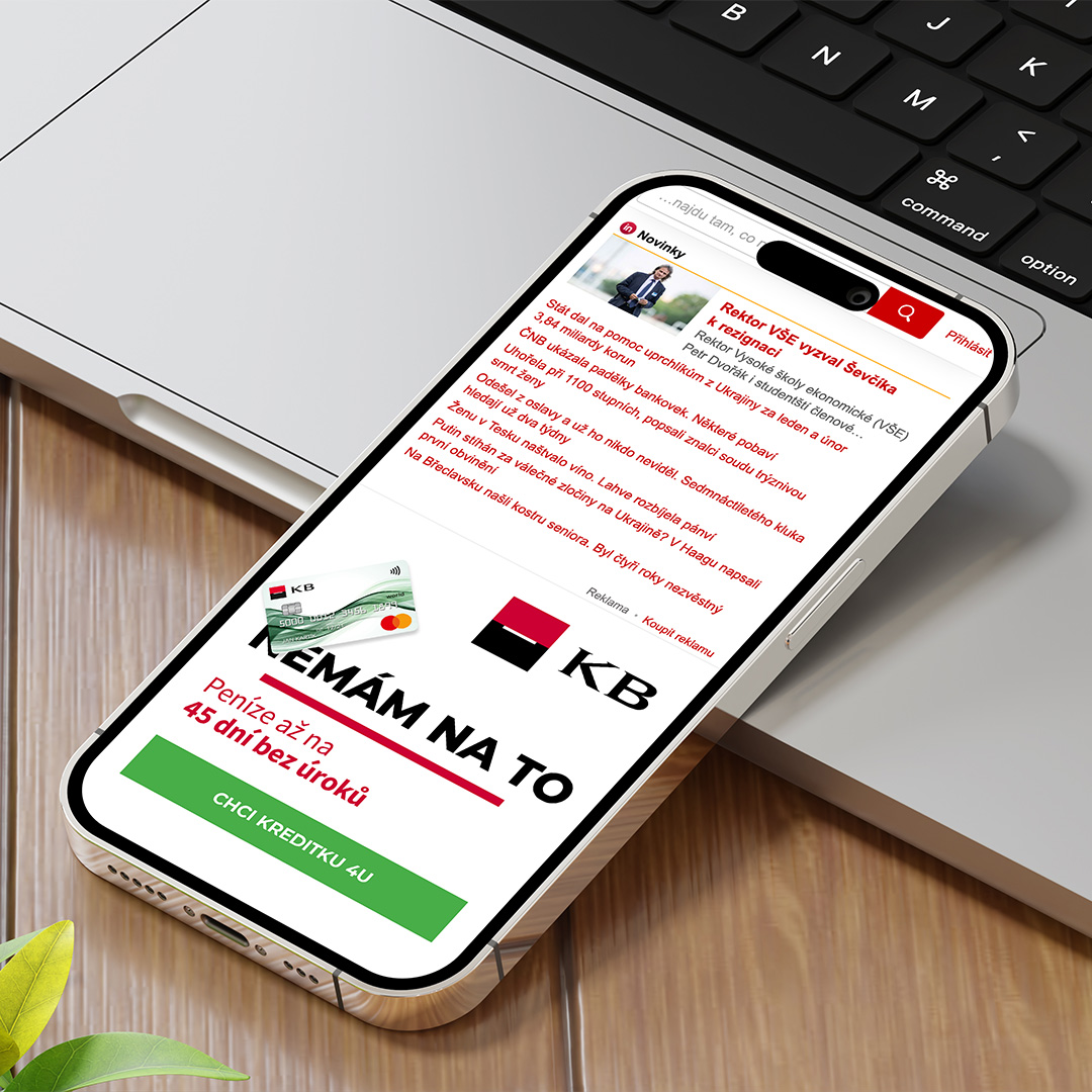
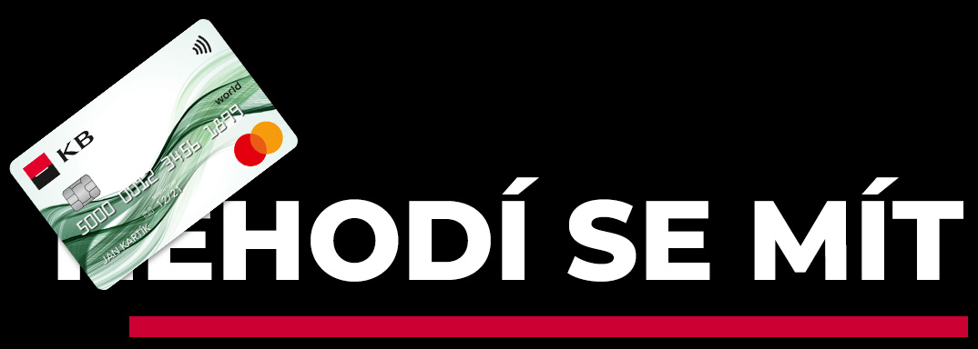
The visual side here was extremely simple, yet bold and effective. No matter if the passangers were busy or in a hury - the message was easy to read and digest even in the morning rush hours.
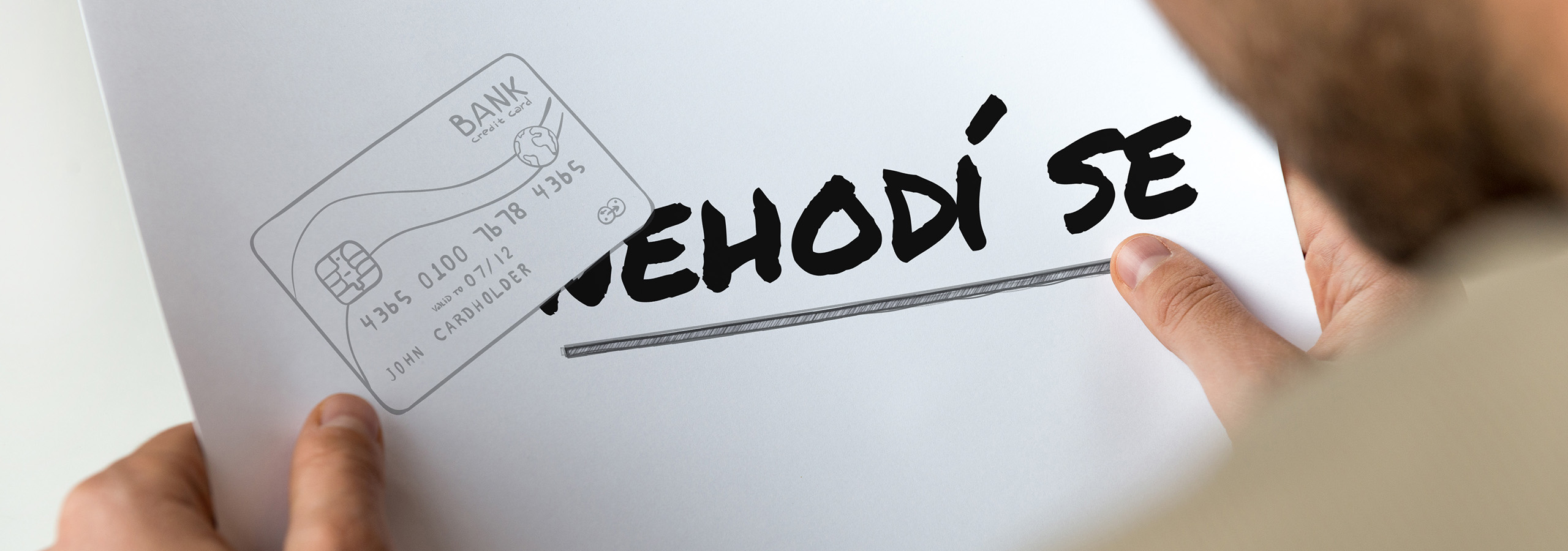
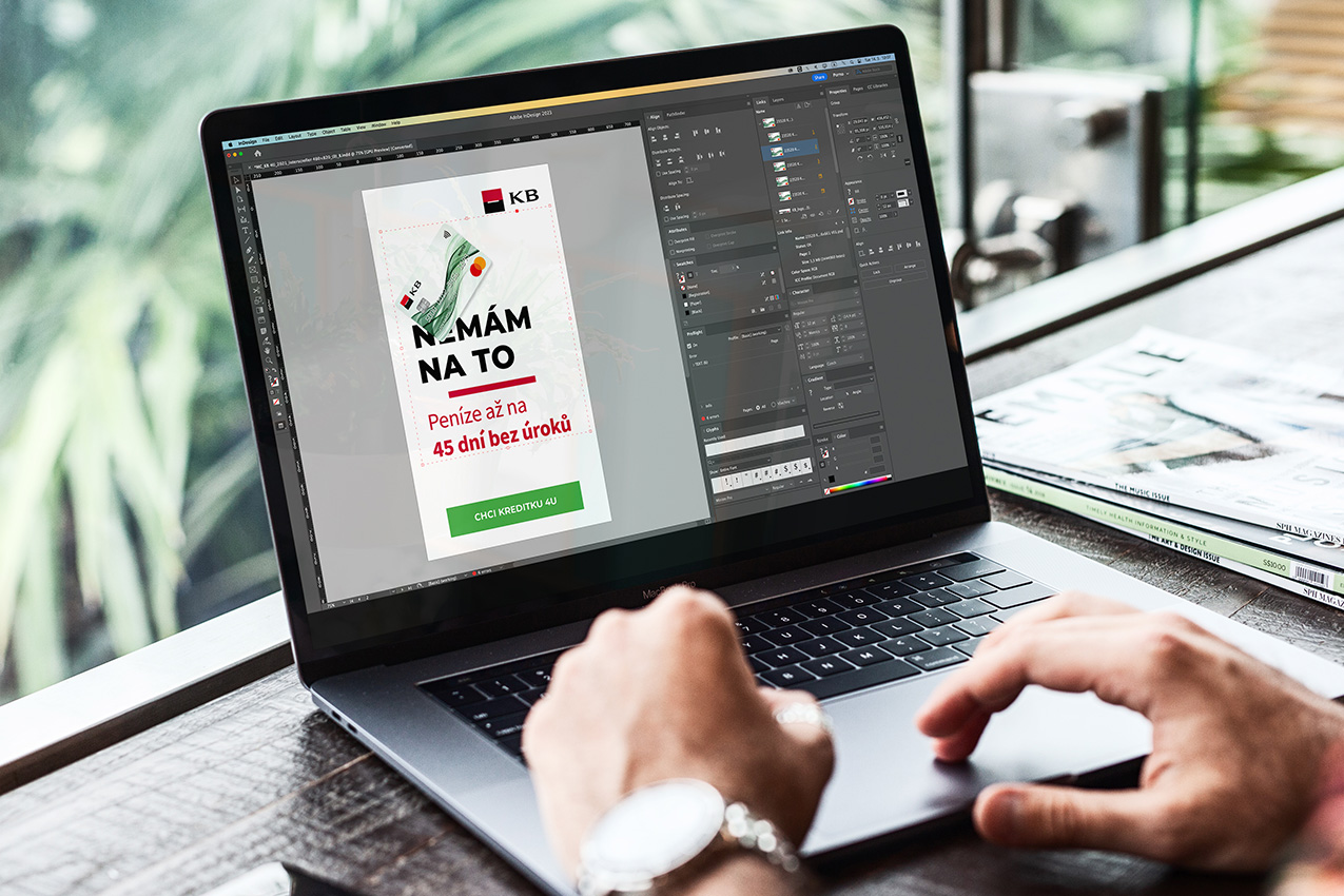
As mentioned above, we really wanted to capture the theme of a free market where the customer has a choice. And the best possible choice here is our client.
Sometimes all you need is a bold text, white background and a core element (the card, in our case). simple, but very effective. A flexible design that works on in all sizes. A design that you can scale infintely and that will clearly communicate the message.

We will get back to you as soon as possible.
